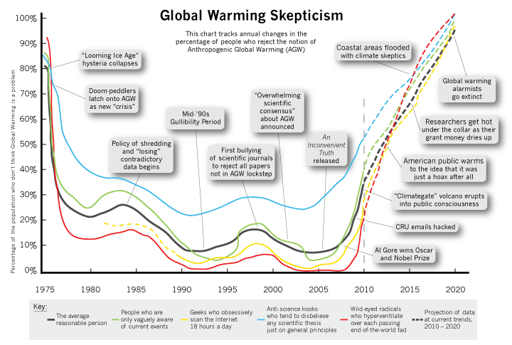
The data underlying the famous “hockey stick” global warming graph has finally been found after having earlier been misplaced by leading climate researchers. The newly recovered data confirms the accuracy of the abrupt upward turn in readings characteristic of the “hockey stick” shape found in many global warming projections.
Up until now, however, the data on which the controversial graph had been based was presumed to be lost, so it was not known exactly which aspects of global warming the chart illustrated. Now that the data has been recovered, scientists can state with complete certainty that this updated chart accurately chronicles the past and future trajectory of the global warming crisis.
View the full-size graph by clicking HERE or on the small version shown below:
(Cross-posted at PJM.)


19 Responses to “New Global Warming Data Reveals Accurate “Hockey Stick” Graph”